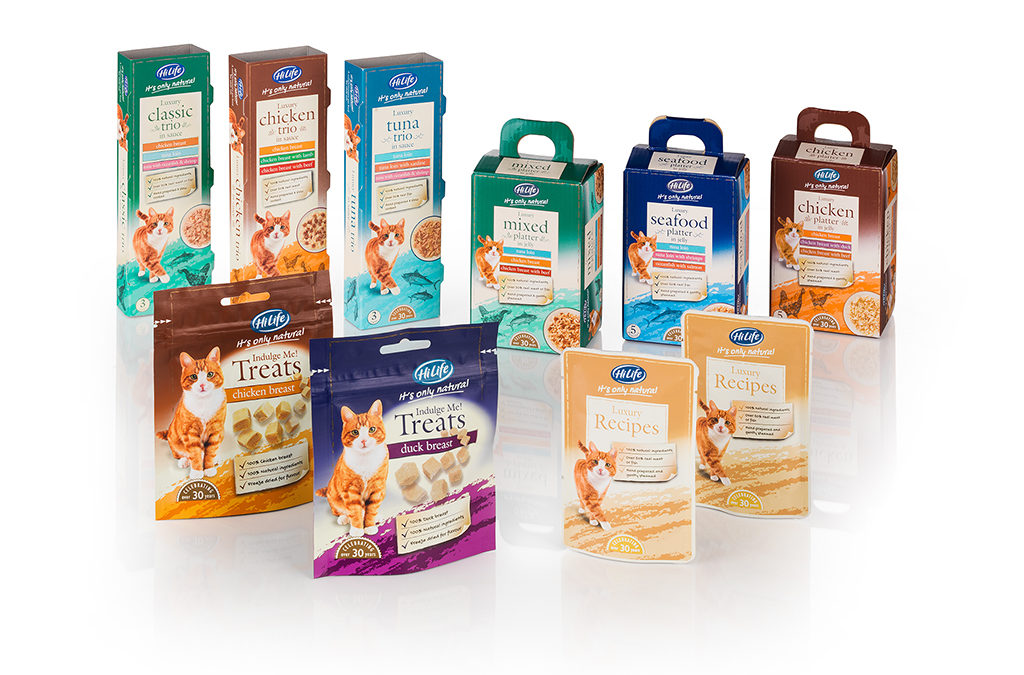
The Brief…
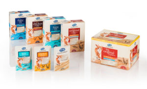
HiLife Pet Food approached Cda Creative to create a new range of cat food packaging designs for their ‘It’s Only Natural’ range.
HiLife had previously struggled to get the look and feel they desired for this important new range and we welcomed the challenge to deliver something very special that would stand out from the already swamped supermarket aisles.
We were asked to consider two main product tiers, including an Ultra Premium and Super Premium range, a National Grocery Exclusive Multipack, plus an extension of this range to include a new selection of flavoured It’s Only Natural Cat Treats.
Where HiLife differs from other brands, is their high level of natural ingredients. They are a family run business of cat lovers and their philosophy is to ‘search the world for the finest quality pet foods’.
HiLife were also very keen for us to create a cat (with an appealing character) that could be used across the entire It’s Only Natural range.
With this in mind the brief to us was simple…bring this unique proposition to life and create a natural, artisan look and feel to increase shelf appeal and brand standout…and a cat that people would love!
Our Approach…
Our team developed a series of three different packaging design concepts and although they were all very different approaches, all three perfectly answered the brief.
Our first option was using ‘watercolour illustrations’ of three different cats (a Tom, Bengal and a Rag-doll), which perfectly captured the ‘luxury and artisan’ feeling that HiLife were trying to achieve.
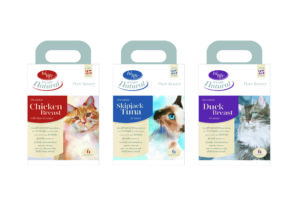
Our second option aimed to capture ‘pure luxury and indulgence’, by using very soft flowing lines and more ‘fine art’ cat illustration approach.
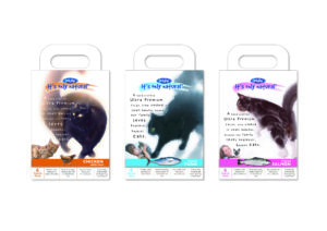
Our third option was taking a ‘photographic route’ but applying artistic photoshop and illustrator effects over the top of the image to create something completely unique to HiLife. We also considerably manipulated the cats features by changing eye colour, making the markings more symmetrical and making more ‘attractive’ and more of a character.
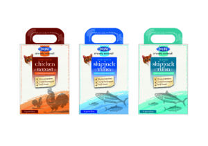
All three designs showed how we could potentially treat the additional packaging sides to suit the brief, the different flavour varieties, font styling, image sizing and most importantly, how we could create a ‘wall of colour’ on the supermarket shelf, so that the products clearly stood apart from the competitor.
The Result…
It was a very exciting. We presented the designs one by one to our client and when we finished, there was just complete silence.
It is always a great moment for us when our client is so pleased with our creative work.
HiLife were very impressed with how quickly we had understood their requirements and created the designs.They even confessed that they were blown away and simply spoilt for choice.
However, they we did agree on a route forward and we are now very proud to see the HiLife It’s Only Natural range in most of the national high street supermarkets, including Sainsbury, Tesco’s, Morrison’s and Waitrose.
To find out more about Cda Creative and how our services can help deliver great results for your business, please get in touch…we would be delighted to help you with your next project.
Suzanne Wells Adgar
Cda Creative
Email: suzanne@cdacreative.com
Website: www.cdacreative.com

